
First impressions count. For streamers one of the best ways to create a great one is with a fantastic looking Twitch overlay.
You can use your streaming setup to convey a lot about you. And how your channel looks can be every bit as important as your content. With that in mind, here’s a quick guide to creating that perfect overlay, complete with examples for inspiration.
The first thing you need to explore is what you want your overlay to convey. Here are some basic things to think about:
- Do you want to customize your overlay based on a game you play most often?
- Do you need a generic overlay that fits multiple types of games?
- Do you need functionality to support chatting or IRL streams?
Once you’ve answered these questions you need to get more specific about the type of overlay you want. You can use your overlay to track many different things. When considering your design think about:
- What information do you need to ensure is visible?
- What colors suit your style and the games you play?
- What do you want to track on your overlay?
You can buy a template overlay or design a custom one. It’s a great idea to search through some existing streamers overlays to get some ideas. Here are some to get you started.
MrLlamaSC Speed Run Overlay
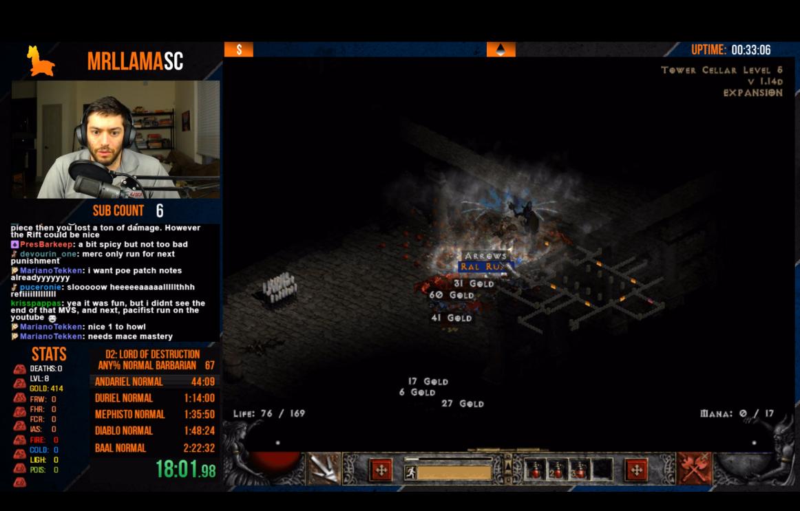
Mr Llama primarily does speed runs of games, particularly Diablo. His overlay fits the theme of the game, which he ensures is always visible in its own block of the screen.
To cut clutter on the game screen he keeps his camera and sub counter to one side. This area also shows a limited chat. It allows viewers to view chat while having full screen on.
He uses the rest of the space to track stats specific details to the current speed run, including timings.
The works well because it allows viewers to see all the important details along with fitting in a face cam. He accomplishes this without covering any gameplay.
Pokimane’s Minimal Overlay
Pokimane’s overlay is minimalistic. Proving that less can definitely be more. Her webcam is a simple square with basic tracking underneath.
She has custom alerts for new followers and subscribers but these pop up in the bottom right of the screen. This minimizes the impact on the game.
This setup shows that you don’t need flashy graphics to become successful. Choosing a style which works for you is much more beneficial.
Dr Disrespect’s High Production Value
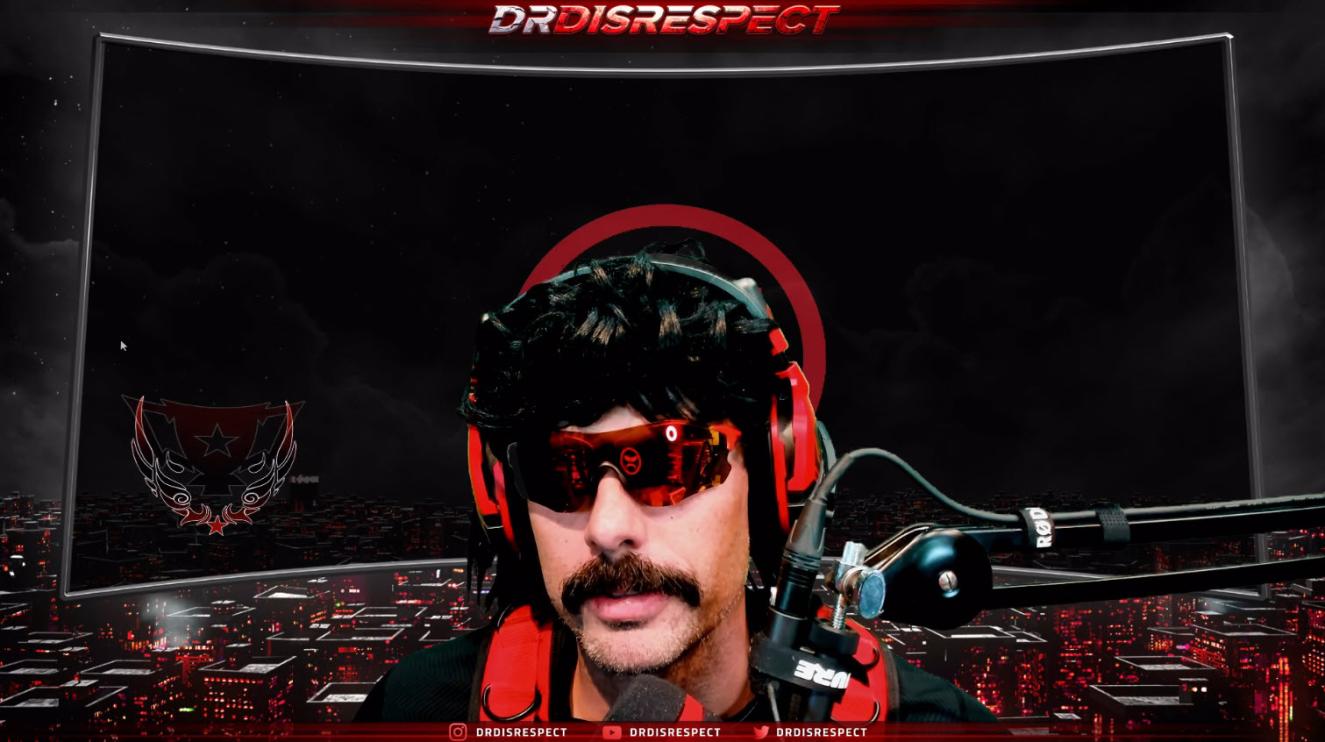
Dr Disrespect is a successful example of a streamer who goes above and beyond with his streams. He brings one of the highest production values to Twitch.
The Dr Disrespect persona is a character designed to entertain and his entire setup builds on this.
Above you can see the his chatting version of his overlay. It shows his face cam front and centre, fitting in with his inflated ego persona. Below his camera you can also see his social channel details. An important aspect of promotion that a lot of streamers hide in their profile.
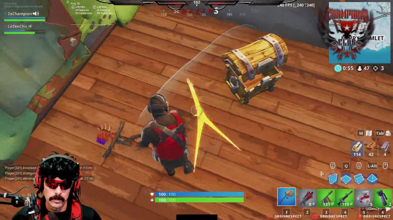
His in game setup is much more minimal, like Pokemane’s. His camera sits in the bottom of the screen, while subscription messages appear in the top right.
At the very top a narrow bar tracks some statistics, while his social details remain in the bottom right. The focus is very much on the game here, something which many streamers strive for.
Ninja’s Overlay Design
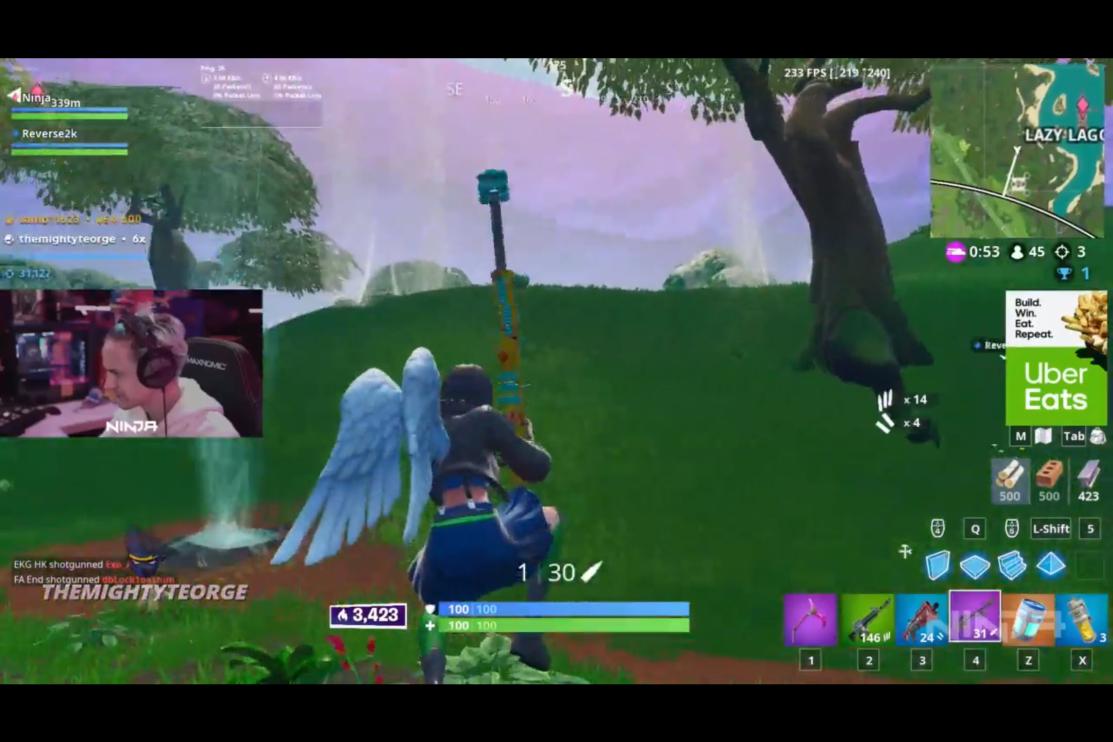
Ninja’s overlay is another minimal design. (Noticing a trend here among top streamers?) It’s made so you can feel like you’re just chilling with the streamer. The use of a camera off to one side is interesting as it doesn’t show reactions in quite the same way. But instead makes you feel more like you’re sat next to a friend.
One unique aspect is Ninja’s use of on-stream sponsored advertisements. He places them on the far side of the screen to be as unobtrusive as possible, while still being visible.
Cuppcaake’s Just Chatting Themed Overlay
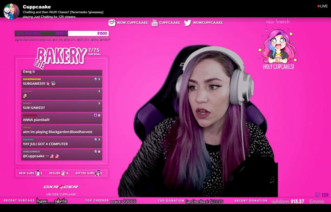
Cuppcaake’s overlay is an example of picking what suits your personality and rolling with it. Her “just chatting” interface clearly shows her love of pink. It even matches her colored hair. The bold choice tells you a lot about her personality and brand.
It’s accompanied by cute emotes and all the information you need. The excessive pink may be in your face but it works for her and her audience. Which is the most important factor.
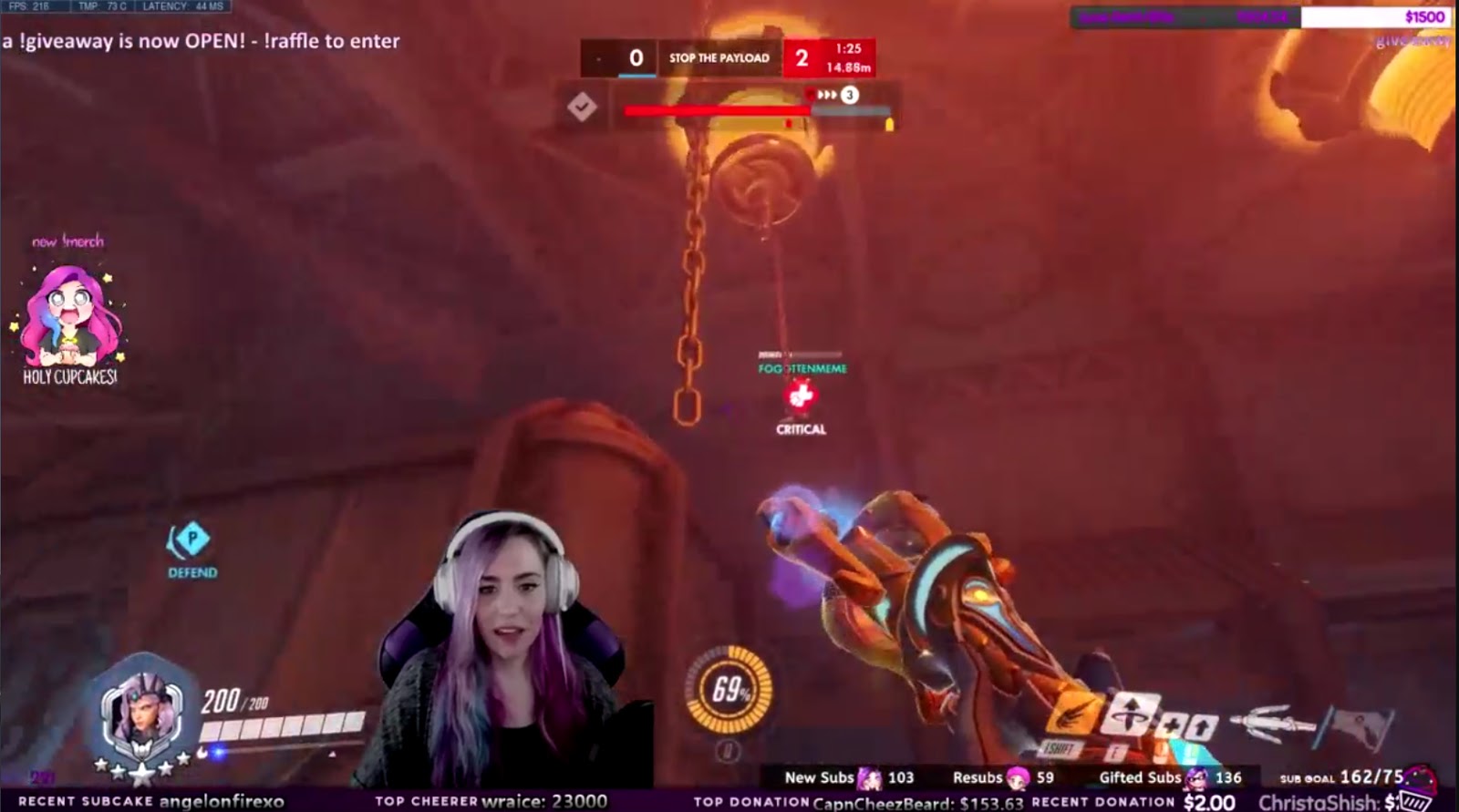
You can see here that the pink gets toned down when the game comes on. This minimalistic interface focuses mostly on the camera. She places it in the best position for the game she’s playing.
Once again we see the idea of a simple bar which tracks stats without obstructing gameplay. Here it’s accompanied by the camera and a quirky ad for merchandise.
Tabletop Tavern’s DnD Themed Design
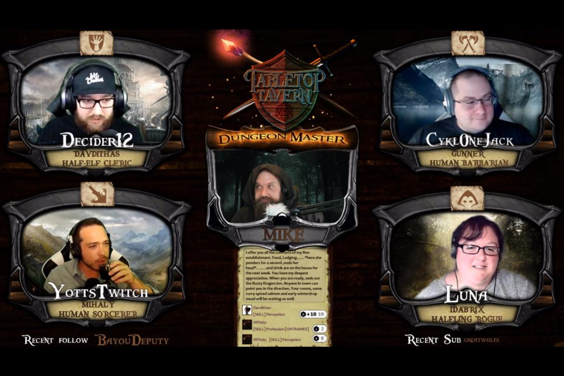
HowINerd’s Tabletop Tavern is a fantastic example of a completely themed overlay. In this “just chatting” interface we can see all the persona’s, along with important details about who they are. The follows and subs along the bottom give shoutouts without being intrusive.
Another nice touch are the subtle backgrounds for each character. It showcases that minor touches can go a long way in pulling together an interesting theme.
We can see an extension of the same design idea in this overlay from an in progress game.
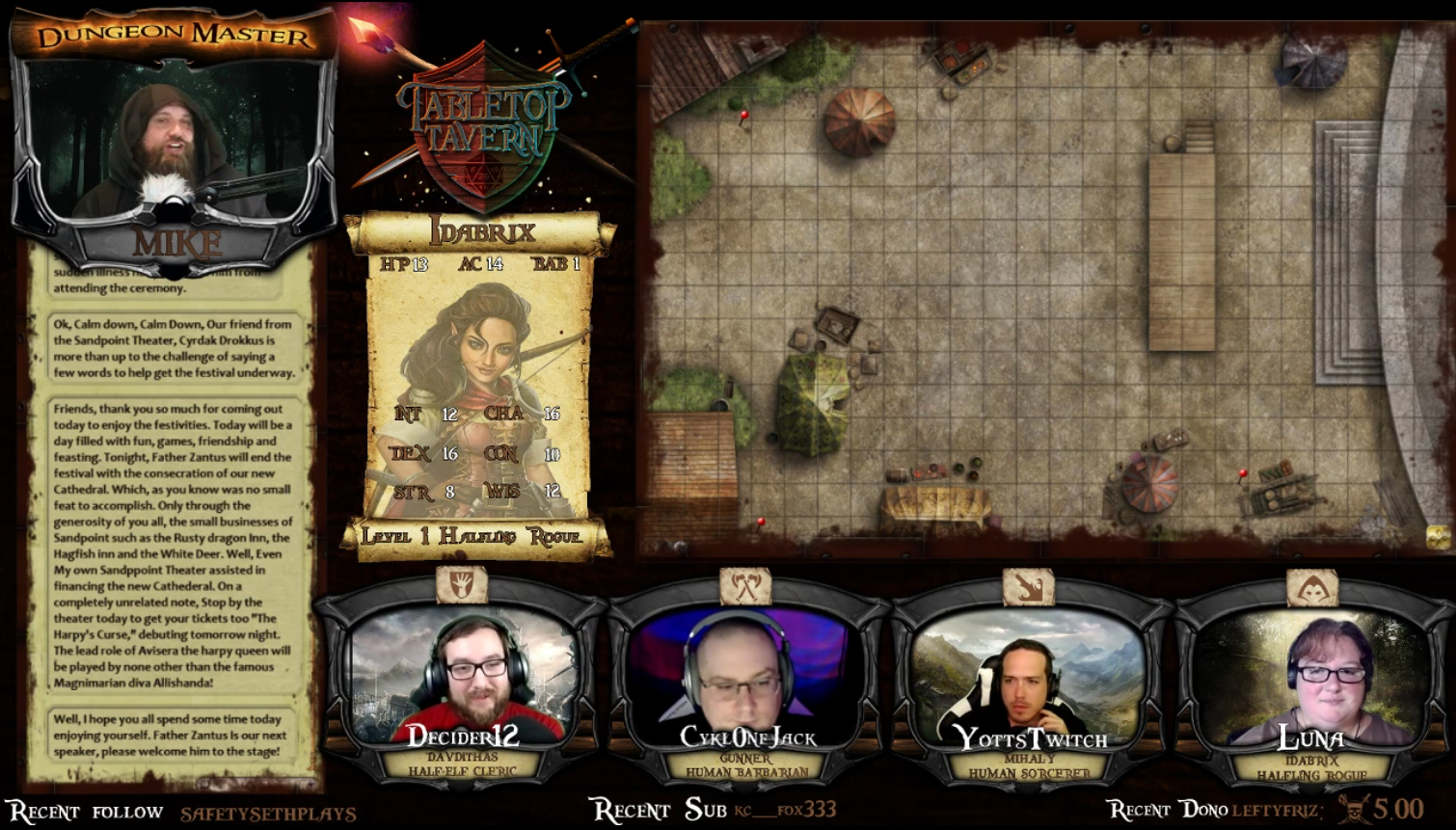
The webcams are still in place but move to the bottom to make room for the board above. Character sheets show the stats and info of the person playing. There’s even space for important game information below the dungeon master.
The interface works so well because it’s designed with the viewer in mind. Everything a viewer needs is always on screen when they need to see it. Then adding a beautiful design to highlight those elements gives it that next level feel.
RoryPlays Gameplay Overlay
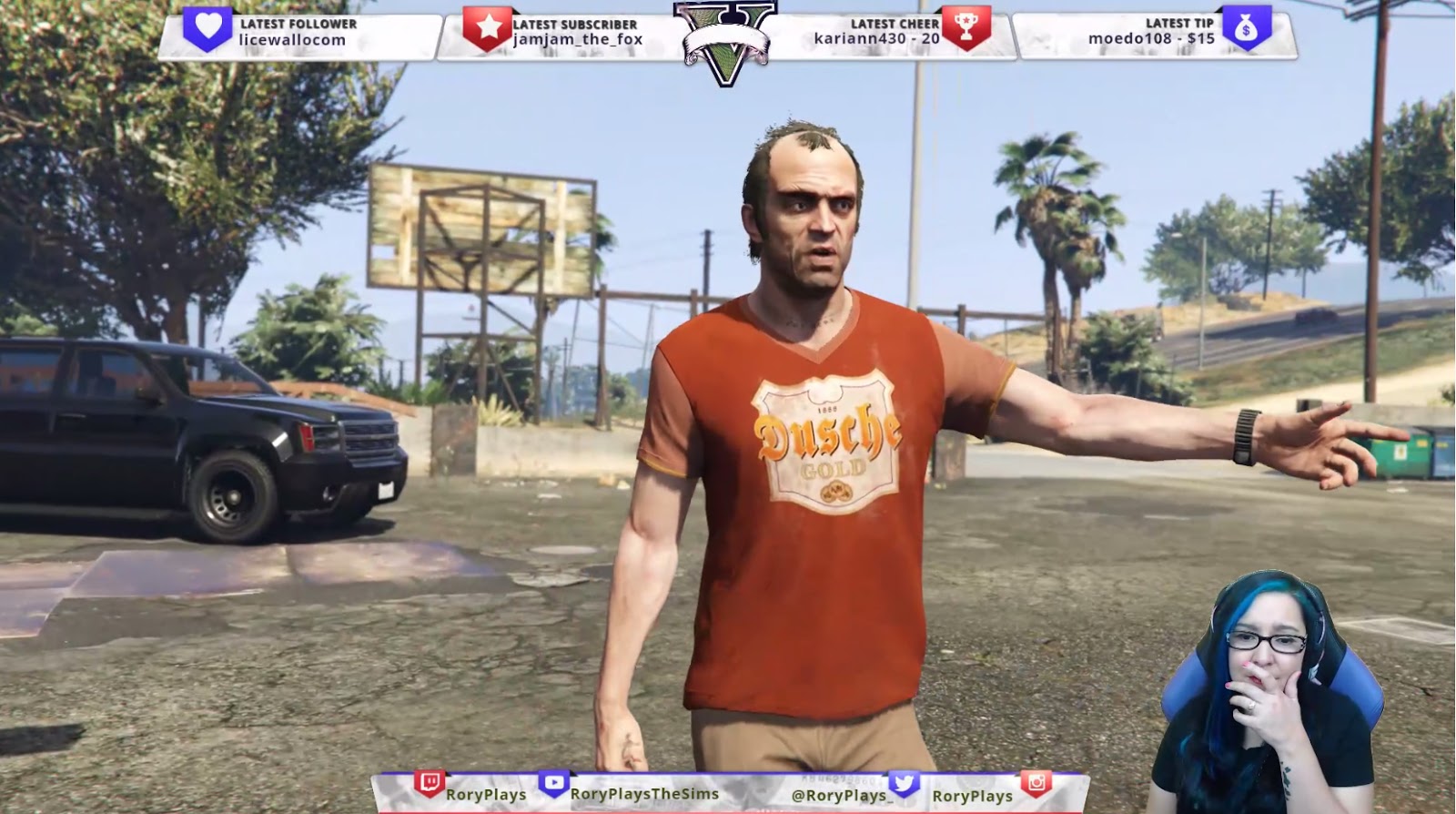
This interface is an example of a game themed layout. The top bar offers tracking, in a style matched to the game, while the bottom bar does the same with social details. Finally a green screen and webcam ensure the outlay stays simple.
The interface is all customized to the game, including notifications and screens.
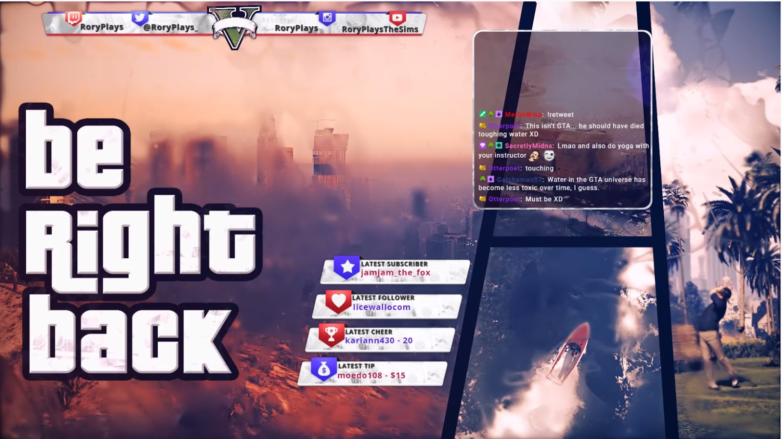
RoryPlays transfers from different screens while keeping them all themed together. Whether it’s the “be right back” screen, “starting soon” screen, or gameplay scene, they all match to the brand. It allows the content to flow, rather than having the screens stand out due to huge style differences.
Dr Gluon’s Interactive Overlay
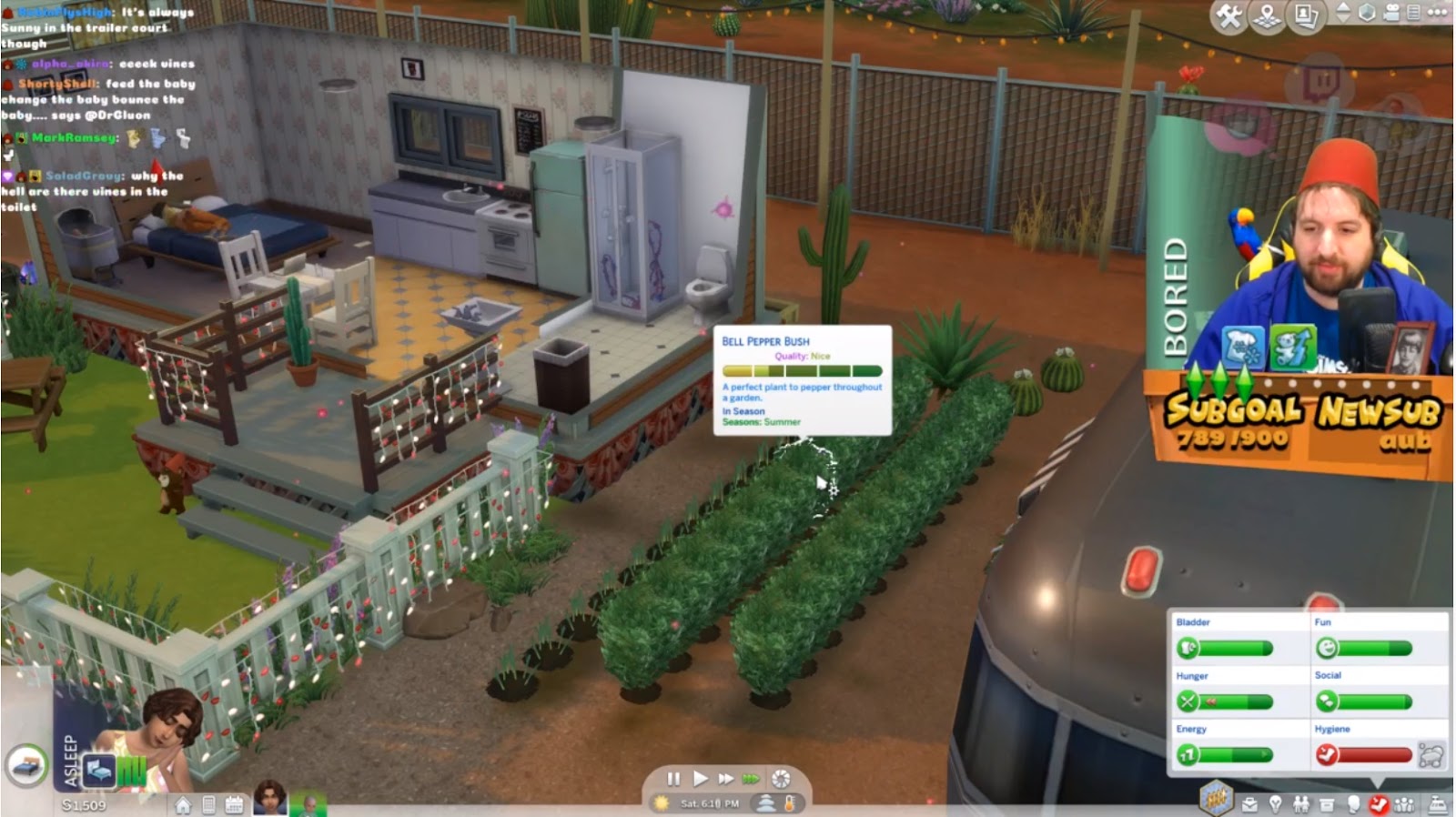
This is not just another game themed interface. Although it does a great job capturing The Sims style. Dr Gluon’s overlay is also animated. The whims above his head and the picture of Jerry in front of him remain static but the moods change. As he plays the game the interface rotates through several different Sims emotions.
The vibrancy of his overlay, combined with the changing animations helps keep it fun and interesting. It fits with his larger than life, fez wearing streaming persona.
Conclusion
When you design your overlay it’s important to remember that it reflects you and your channel.
If you feel out of your depth in design then remember that a simple overlay can be as effective as a complex one. Some streamers don’t use any overlay at all.
It all depends on your needs and that of your channel. Make sure important information is visible and don’t be afraid to have fun with it. After all an overlay is a great way to show people who you are.

